One of the most important principles of good web design is the layout of the pages. This refers to the size and positioning of the page’s elements, including text, headings, and pictures, among other things. Different types of pages are better suited for certain layouts. For example, you’ll find that most About pages use the z-pattern, whereas in many cases using an f-layout on the home page would not be a very good choice. Choosing the appropriate layout for a page can greatly enhance the user experience, in many cases making it easier for users to find the information they are looking for. We’ll discuss five of these layouts in this article:
5 Web Design Layouts and How to Use them on Your Website
One of the most important principles of good web design is the layout of the pages. This refers to the size and positioning of the page’s elements, including text, headings, and pictures, among other things. Different types of pages are better suited for certain layouts. For example, you’ll find that most About pages use the z-pattern, whereas in many cases using an f-layout on the home page would not be a very good choice. Choosing the appropriate layout for a page can greatly enhance the user experience, in many cases making it easier for users to find the information they are looking for. We’ll discuss five of these layouts in this article:
- Full screen layout
- Z-pattern layout
- F-pattern layout
- Card layout
- One-column layout
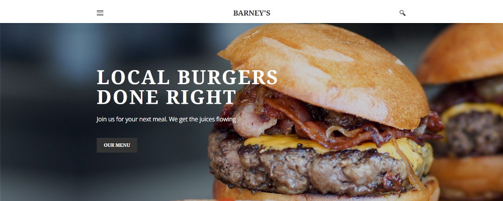
The first layout we’ll discuss is the full screen image layout. This layout involves filling the entire screen with a picture or graphic. This layout is ideal for grabbing the attention of your website’s visitors. Many web designers use this layout on home pages as a way to not only grab attention but also to clearly communicate what your business does. For example, if you’re a restaurant, you can show the most appealing picture of your food. The full screen image is a great way to get people’s attention while also showing off your best work. Knife Burger’s website serves as an excellent example of this technique. They display a slideshow of fullscreen pictures of their juicy, delicious burgers. The full screen image layout can be an excellent way to work up an appetite in your customers for whatever you’re selling.
1. Full Screen Layout
The first layout we’ll discuss is the full screen image layout. This layout involves filling the entire screen with a picture or graphic. This layout is ideal for grabbing the attention of your website’s visitors. Many web designers use this layout on home pages as a way to not only grab attention but also to clearly communicate what your business does. For example, if you’re a restaurant, you can show the most appealing picture of your food. The full screen image is a great way to get people’s attention while also showing off your best work. Knife Burger’s website serves as an excellent example of this technique. They display a slideshow of fullscreen pictures of their juicy, delicious burgers. The full screen image layout can be an excellent way to work up an appetite in your customers for whatever you’re selling.
2. Z-Pattern Layout
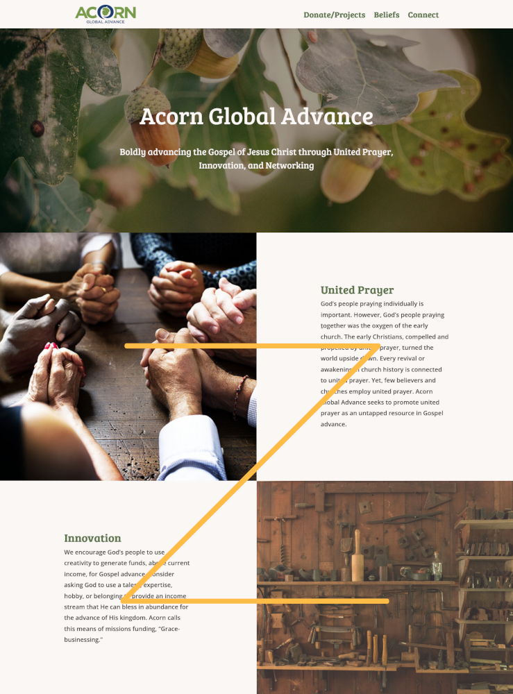
The second layout we’ll discuss is the z-layout. This layout involves placing text on alternate sides of the screen, like in the example below. Breaking up the text into more digestible amounts, while also pairing the text with interesting pictures, makes this layout a great way to display long amounts of text without boring your viewers. Additionally, when people scan web pages, their eyes naturally follow the z-pattern. Because of this tendency, this layout makes it much easier for people to quickly scan the page. If you’d like to see an example of this layout, you can checkout the home page for Acorn Global Advance.
3. F-Pattern Layout
The third layout we’ll discuss is the f-pattern. This involves placing a picture on the left hand side of the screen, and then placing a heading and some description text to the right of the picture. Ideal for lists, this layout can be used to display a blog post picture, along with the blog title and a short description. The f-pattern is a great way to list website information, and makes it easy for viewers to quickly scan the page to find the information they’re looking for. To see an example of this layout, you can check out the blog for the news website AllSides. (As a side note, I’d highly recommend AllSides as a new source. Their goal is to “expose people to information and ideas from all sides of the political spectrum so they can better understand the world — and each other” – a very important and necessary task in these very politicized times.)

4. Cards Layout
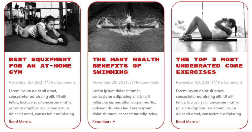
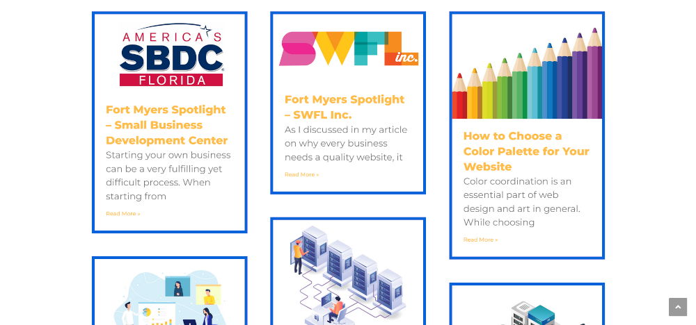
One problem with the f-pattern is that it’s not well-suited for long lists, and it can be a rather lengthy way to list things like blog articles. This problem can be solved using the cards layout. This layout involves providing each link with its own card, inside of which is usually a picture, a heading, and a description of the page being linked to. This layout can be a great way to list lots of blog posts in a more condensed, neat format. To see an example of this layout, you can check out the blog page for Octagon Fitness.
Sometimes the card layout can result in an unnecessary amount of whitespace inside the cards, as you can see in the picture below. This can be solved by using a variation of the cards layout known as the masonry layout. This layout allows for different heights of the cards based on the amount of content within the cards. This results in an even more condensed and efficient layout by removing the unnecessary white space. The blog page for my own website actually makes use of this layout.
5. One-Column Layout
The last layout we’ll discuss is the one-column layout. This layout is very minimalist and is ideally suited for pages like blog articles. This layout helps to limit distractions and keep readers focused due to the fact that the text of the post is the only thing being displayed on the screen. This layout is also very mobile friendly. If you know that many of your website visitors access your website using mobile phones, this can be a great way to cater to the preferences of your customers.
Conclusion
In this article we discussed five of the most common web design layouts. However, these are not the only layouts available for use. There are many other potential web design layouts you can use. Additionally, it’s important to remember that each web page does not have to be limited to just one layout. Web designers can and should mix and match the different layouts in their web pages. For example, my home page includes a full screen vector graphic, a z-pattern section, and then single-column sections for the portfolio, reviews, and contact form. Picking the right layouts for your website’s pages is an essential component to designing a website. If you need help with this task, feel free to reach out to me at (239) 776-9180 or info@blueprintwebdesign.com. I’d love to help you choose the best layout for your website.
