One of the most important elements of a good movie is the visual appearance of the movie. Directors have invested millions of dollars and countless hours into the cinematography of their movies, resulting in beautiful works of art such as “Dune” and “La La Land.” At first glance, cinematography and web design do not appear to have much in common. However, the principles of art and design apply just as much to websites as they do to movies. Web designers can learn a lot about how to enhance the quality of their websites from the cinematography seen in movies. In this article, we’ll take a look at five principles of cinematography that can help to improve the look of your website.
The first principle we’ll discuss is the rule of thirds. This refers to dividing the camera frame into thirds, both vertically and horizontally. After dividing the image, you then align the subject with one of the intersections. The human eye is naturally drawn to these areas of the frame, making it the ideal area to place the subject of either a scene or a web page. This technique is used in nearly every movie ever made, but is especially noticeable in “The Secret Life of Walter Mitty” as you can see in the pictures below.
What do Batman and Aflac have to do with each other? They both use the second principle we’ll discuss today: color coordination. Choosing a color palette and using it consistently throughout the entirety of a movie or website adds a degree of congruity and uniformity that makes the movie or website more visually pleasing. Matt Reeve’s “The Batman” has been repeatedly praised for its excellent cinematography, and one of the contributing factors is the consistent red, orange, and black color scheme seen throughout the movie.
The third principle is color psychology. This refers to using colors to convey different kinds of emotions or evoke certain ideas. While not an exact science, it’s generally accepted that each color is associated with certain emotions and ideas, and many directors have made great use of these associations in their movies.
For example, red is often used to indicate danger or evoke passionate emotions like love or anger. This makes it a good choice of color for “The Batman” as it further emphasizes the passion and anger that motivates Bruce Wayne. Red is also used to great effect in the movie “Ex Machina”, when Ava begins to erode Caleb’s trust in Nathan. The frame is filled with a menacing red light as Ava attempts to convince Caleb that Nathan is not his friend. The scene leaves no doubt in the minds of the audience that Ava poses a dangerous threat to Nathan and Caleb.
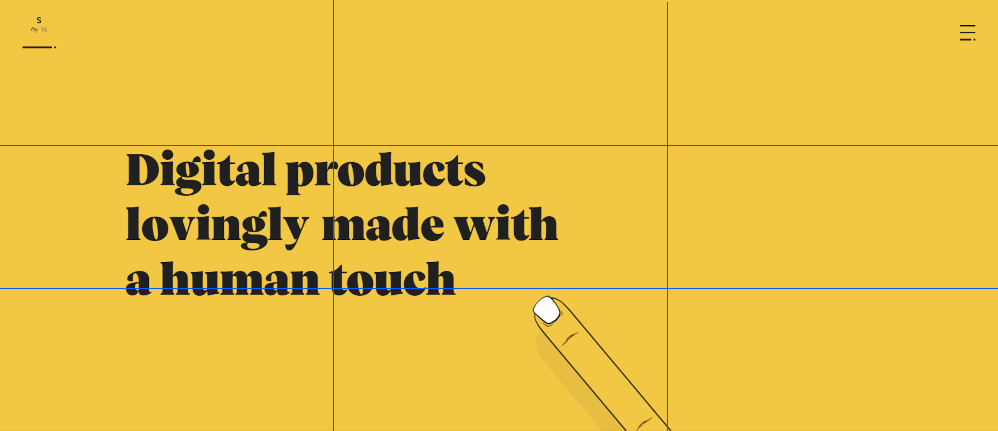
Yellow is also used by many brands to grab attention and communicate feelings of happiness and optimism. In the picture below, you can see that Snapchat almost exclusively uses the color yellow on its website.
Contrast is one of the most important techniques in web design, and is often used to draw attention to buttons that the business wants you to click. Two examples of this technique are ups.com and greenbeetz.org.
UPS likely knows that one of the main reasons people go to its website is to track their packages. In light of this, UPS draws attention to the “Track” button by highlighting it in yellow, heavily contrasting with the brown background while also going along nicely with its brand color scheme.
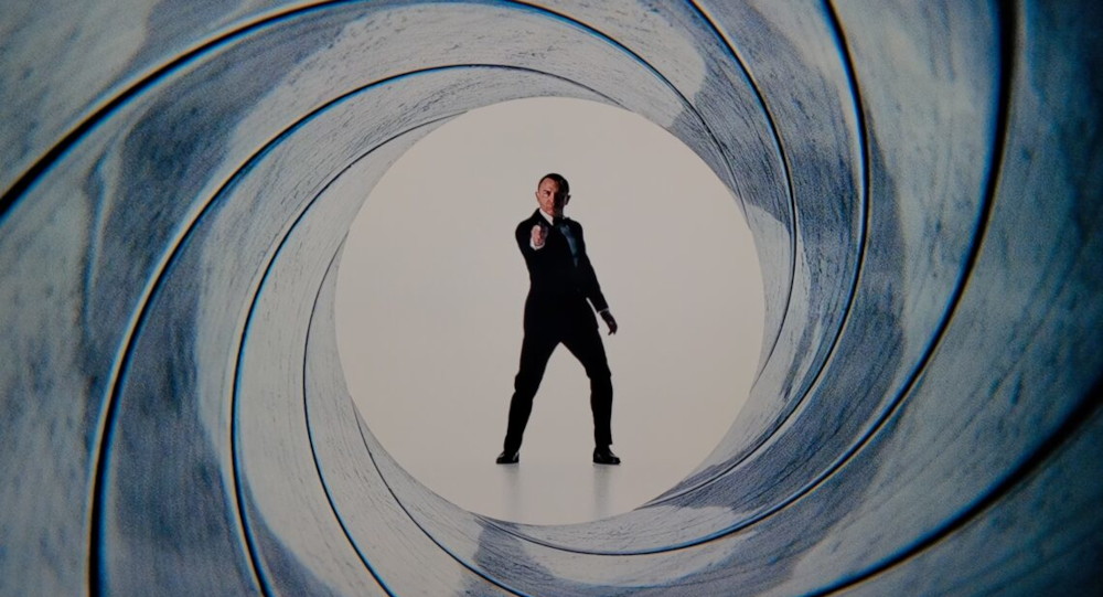
Lastly, the fifth principle is the use of lines to lead viewers’ attention to the subject. Line leading is used often in movies to direct viewers’ focus to the subject of the scene. Examples of this technique can be seen in nearly every “James Bond” movie ever made. The rifling of the gun barrel inclines viewers to look down the barrel at 007. And, similarly, in “Knives Out”, the knives in this scene form a circle around Benoit Blanc, practically forcing our attention to the famous detective.